Stop Using The Default Boilerplate for Creating Bottom Tab Icons in React Native. Use this instead.
Almost every mobile application requires some form of navigation. It is either bottom tab navigation, drawer navigation, or top tab navigation. And, yes, creating any type of this navigation in a React Native project is not difficult. But you are not doing it the correct way.
Only the first or second time you implement any type of navigation You make errors. Sometimes you forget to add additional dependencies, or your project requires a clean build, or you write some code in MainApplication rather than MainActivity, and so on. But all the types of errors you can avoid by just following the given documentation.
But there is something you can’t avoid while setting up navigation.
export default function App() {
  return (
    <NavigationContainer>
      <Tab.Navigator
        screenOptions={({ route }) => ({
          tabBarIcon: ({ focused, color, size }) => {
            let iconName;            if (route.name === 'Home') {
              iconName = focused
                ? 'ios-information-circle'
                : 'ios-information-circle-outline';
            } else if (route.name === 'Settings') {
iconName = "focused" 'ios-list' : 'ios-list-outline';
            }You can return any component that you like here!
      return <Ionicons name={iconName} size={size} color={color} />;
          },
          tabBarActiveTintColor: 'tomato',
          tabBarInactiveTintColor: 'gray',
        })}
      >
        <Tab.Screen name="Home" component={HomeScreen} />
        <Tab.Screen name="Settings" component={SettingsScreen} />
      </Tab.Navigator>
    </NavigationContainer>
  );
}
The above code is given in the official documentation of React Native Bottom Tab Navigation for creating bottom tab icons.
This is just to show how you can use "Tab. Navigator” to show different icons for each screen in the Navigator.
However, after working on more than five React Native projects, I see this same type of code written everywhere. I assumed the projects were started by the same person, but I see it on almost every site, forum, and thread I visit.
What is the problem with this code? Is it less optimized? It will not work sometimes? It will cause an issue in the release build?
No, but there is always a better, more effective, clean, and easily readable way to do things like this.
Check Out How You can do same with Api Calls is Your Project
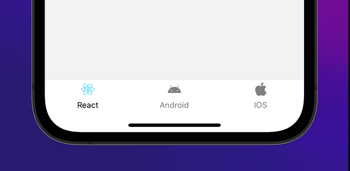
Once we finish creating our tab navigation, it is going to look like
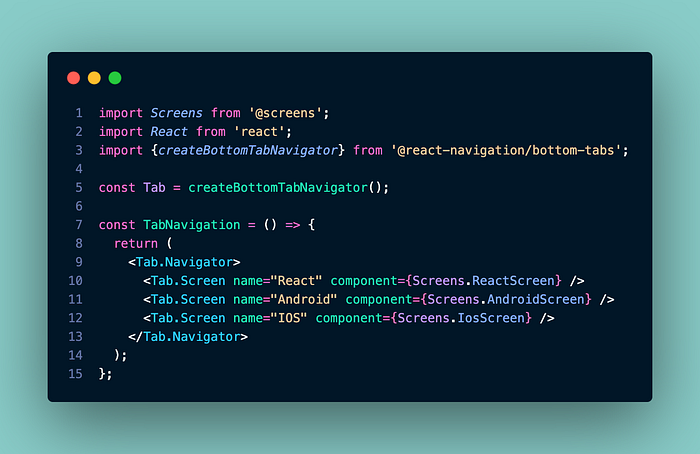
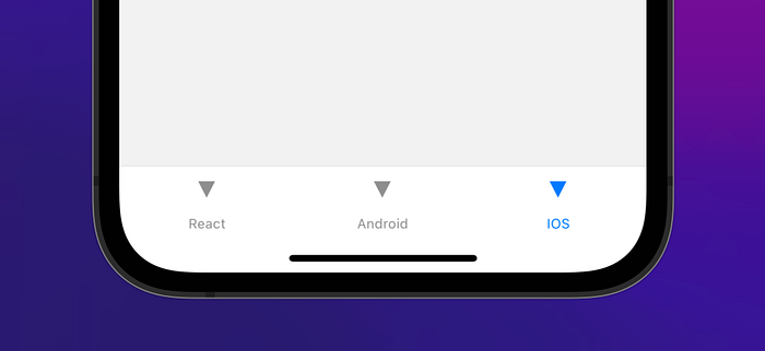
This is the default view we get in the bottom tab navigation. We can add different icons for each tab using the tabBarIcon key in the options prop of “Tab.Screen” as mentioned in the official documentation
const Tab = createBottomTabNavigator();function MyTabs() {
  return (
    <Tab.Navigator
      initialRouteName="Feed"
      screenOptions={{tabBarActiveTintColor: '#e91e63'}}
    >
      <Tab.Screen
        name="Feed"
        component={Feed}
        options={{
          tabBarLabel: 'Home',
          tabBarIcon: ({ color, size }) => (
            <MaterialCommunityIcons
               name="home"
               color={color}
               size={size}
            />
          ),
        }}
      />
      <Tab.Screen
        name="Notifications"
        component={Notifications}
        options={{
          tabBarLabel: 'Updates',
          tabBarIcon: ({ color, size }) => (
            <MaterialCommunityIcons
              name="bell"
              color={color}
              size={size}
            />
          ),
        }}
      />
      <Tab.Screen
        name="Profile"
        component={Profile}
        options={{
          tabBarLabel: 'Profile',
          tabBarIcon: ({ color, size }) => (
            <MaterialCommunityIcons
              name="account"
              color={color}
              size={size}
            />
          ),
        }}
      />
    </Tab.Navigator>
  );
}
But the same code is repeated three times, which may be repeated more based on the number of tabs.
So we are going to use the best option, which is just passing the icon from the screen options panel of "Tab.Navigator."
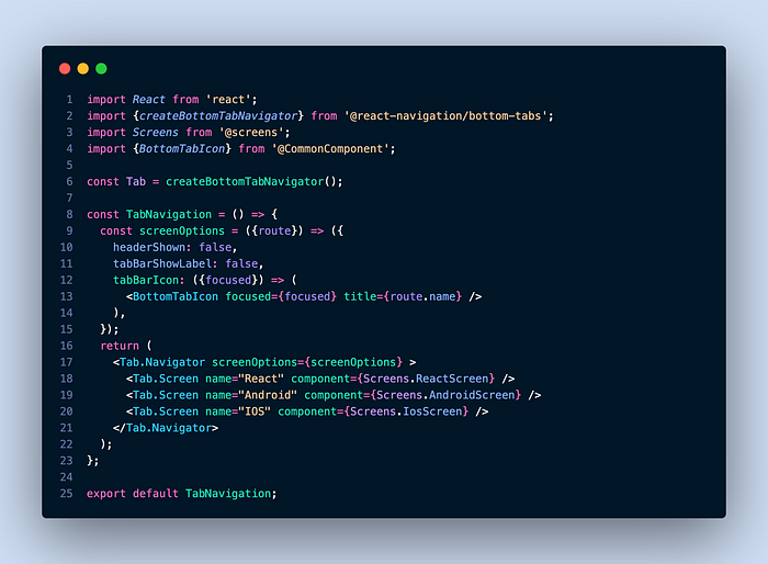
This is everything we need from this file. We can close this file and work on the component we created, BottomTabIcon.
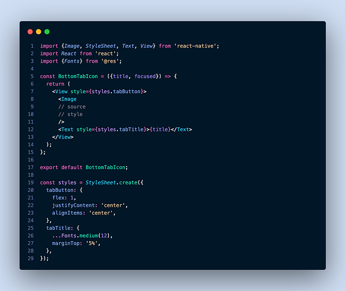
Till now, we have written a lot of code, but on the mobile side, it’s the same as before; it’s just that the triangle icons are not visible.

Now, in the next step, it depends if the assets of your mobile application are stored locally in a folder. And we will also try this approach with vector icons. Other than these two, if there is any other way you manage icons in your native app, please share it in the comment section.
All the icons related to the bottom tab bar are stored in a separate folder like this.
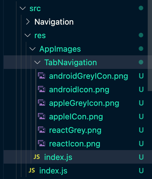
And the index.js file of the AppImages is going to be like this:
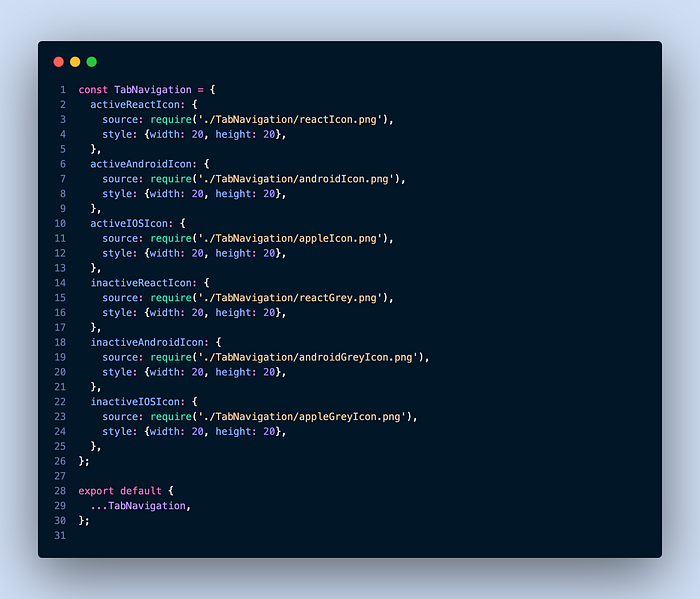
That’s great if you already know what I’m going to do next by reading the image keys.
To produce something like in the next step, you’ll need to know some basic Javascript and have an open mind.
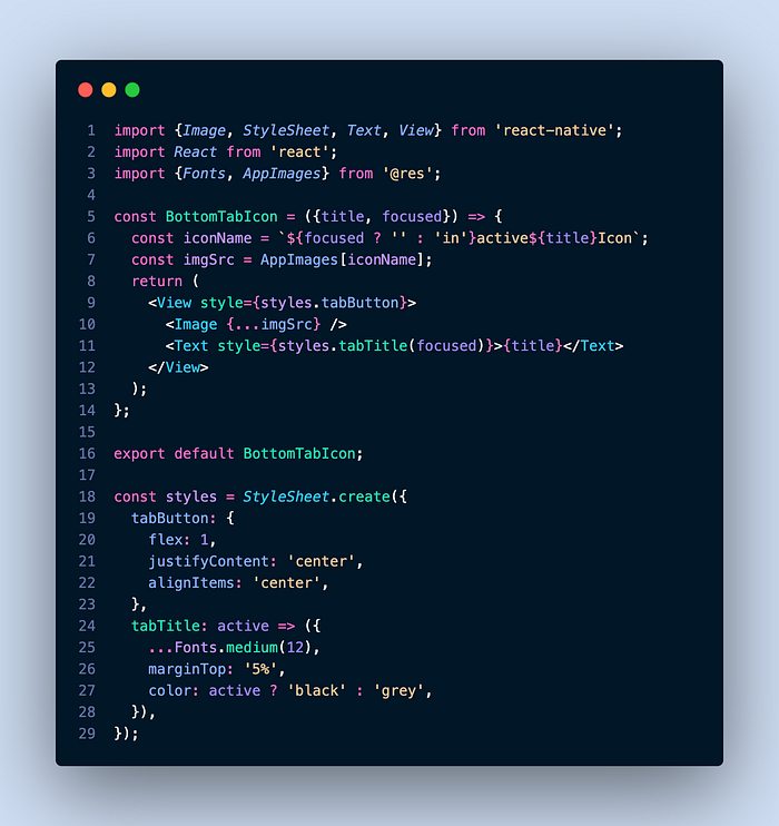
The title of the screen and whether it is focused or not are the only two things we need. With the help of these two values, we can access all six images accordingly.
Variable iconName is the key, which we access from AppImages, and imgSrc is the object containing the icon source and style.
Destructuring the imgSrc in the Image element, so we don’t have to write one extra line separate from source and style, and with this, we can also change the width and height of the icons in the AppImages accordingly.
Now checkout the final output
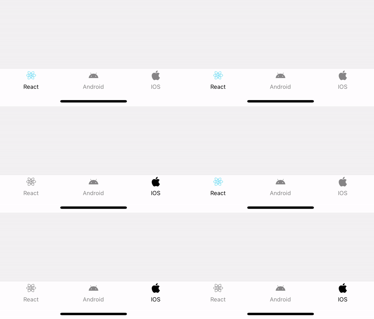
And that’s it; now you can modify this according to your needs. Thanks for reading the article; if you found it a little bit helpful, please follow and share it with other React Native developers. And please comment if you have any suggestions.
